Blog ATOP Officially Launched the Brand-New Company’s LOGO
ATOP Officially Launched the Brand - New Company’s LOGO
SDGI’s acquisition provides ATOP with the opportunity to remain competitive by bringing funding guarantees and various resources that will enable ATOP not only to meet the cost reduction challenges but to reduce potential bottlenecks and risks in the later development to become a global leader.
To achieve this goal, ATOP developed a new brand identity and a new way of communicating on all platforms which was officially revealed on January 8th, 2020. With the new brand strategy, ATOP is on its way to achieve a stronger market position and a more interactive way of communicating with both existing and potential clients.
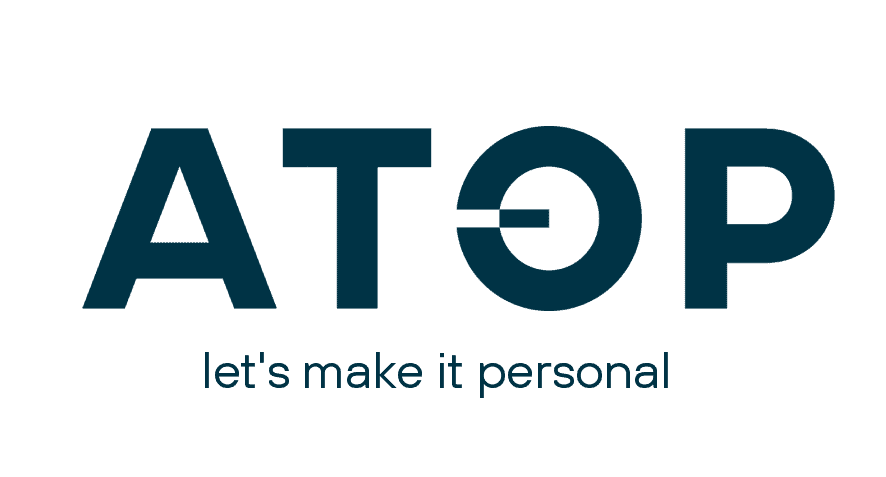
What does the new “ATOP” represent?
The brand mark is a symbol of ATOP’s identity and is an important signal to the market about who we are and what we do. The letter “O” describes a circle — a universal symbol with extensive meaning. It represents the notions of totality, wholeness, original perfection and is one of the oldest and most powerful symbols. Symbolizing the ongoing initiation and continuation of things – nothing is static. The circle also represents a 360-degree view, looking outward from all angles and taking input from all directions. The rounded shape tends to send a positive emotional message of harmony and protection. The circle is often used in symbolism to represent unity, commitment, love or community.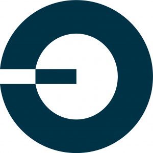
The modification of the “O”
- A movement from left to right in Western philosophy means moving forward. Thus, ATOP’s “O” modification signals the momentum of moving forward for the company, its solutions, engagement and partnerships.
- A symbolic translation of binary language – zeroes and ones. Imagine moving the small “square” in and out of the circle, describing “connect” (in the circle) and ”disconnect” (out of the circle).
- Solving a basic paradox: Describing a square from a circle. Only companies with an imaginative mindset can do so. Companies like these are some of the most attractive partners to work with because they can identify solutions that otherwise would not be possible. The modification has “yin and yang” symbolism which denotes the two sides of transceiving and balance.

Share this news
Share on linkedin
Share on facebook
Share on twitter
Related news

ATOP at OFC 2022: Trade Show Exhibition Announcement!
January 26, 2022
ATOP Will Attend 2019 ECOC Exhibition with High Data Rate Products
September 12, 2019

Get in touch to learn more
Get in touch
© ATOP Corporation. powered by kongfuseo
